Houston Streets 15--Frostwood & Memorial Forest
The area I rode in yesterday consists of the subdivisions just east and west of Gessner between Memorial and I-10.
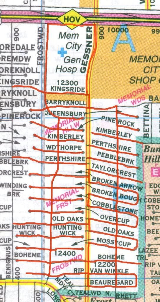
The residential streets branch off of two north-south streets, Plantation and Frostwood. My understanding is that this area was developed by a man named Frost, but I can't find details. The houses here were built mostly between 1959 and 1965. The lots tend to be small compared to those in the Villages (just east of these subdivisions). In fact, if you go immediately south or west, the lots and the houses tend to be larger. This is where Memorial starts to become the more familiar kind of Houston suburb--similar houses on same-sized lots, with developers reusing floor-plans and exterior designs.

These two houses (on Beauregard and Pine Rock respectively) are basically mirror images of one another. The Pine Rock house seems to have a slightly shallower roof, and the original white bricks have been painted. (The design seems to have been a semi-Japanese pastiche--by far the most exotic of the standard plans the developers used). The further west you go, the more pronounced this approach to development is. Swamplot had a great post about four identical houses in Bear Creek Meadows, all foreclosed or close to it, for sale. Those houses were only four years old. When houses are over 40 years old, time can start granting them some individuality. People plant their yards differently (and oaks planted 40 years ago are quite majestic now), they paint their houses different colors, they change their walkways or exteriors or roofs, etc. But the variation is very small. I had a Steve Reich album on my IPod as I rode (Sextet, Piano Phase, and Eight Lines played by the London Steve Reich Ensemble--I recommend it highly), and it occurred to me that a neighborhood like this is like a Steve Reich piece, where there is a comfortable, rhythmic sameness with tiny changes as you go along. The tiny changes wouldn't have even caught my eye while riding through the much more heterogeneous Memorial Villages, but here they stand out.
(One reason why houses seem so similar in these middle class subdivisions is that developers designed them that way, but another reason is that the residents here place a high value on conformity. The problem is that individuality and eccentricity are seen as potentially destructive--economically (home values may fall) and even socially. And even if the residents could accept outward signs of eccentricity, it's hard for most people to distinguish between eccentricity and socially pathological behavior. The average homeowner, looking at his neighbor's front yard, may be unable to distinguish between a rusted car on blocks and a John Chamberlain sculpture--so it is easier to simply disapprove of both. Which is too bad for me because I, of course, favor outward expressions of individuality when I'm riding my bike around.)
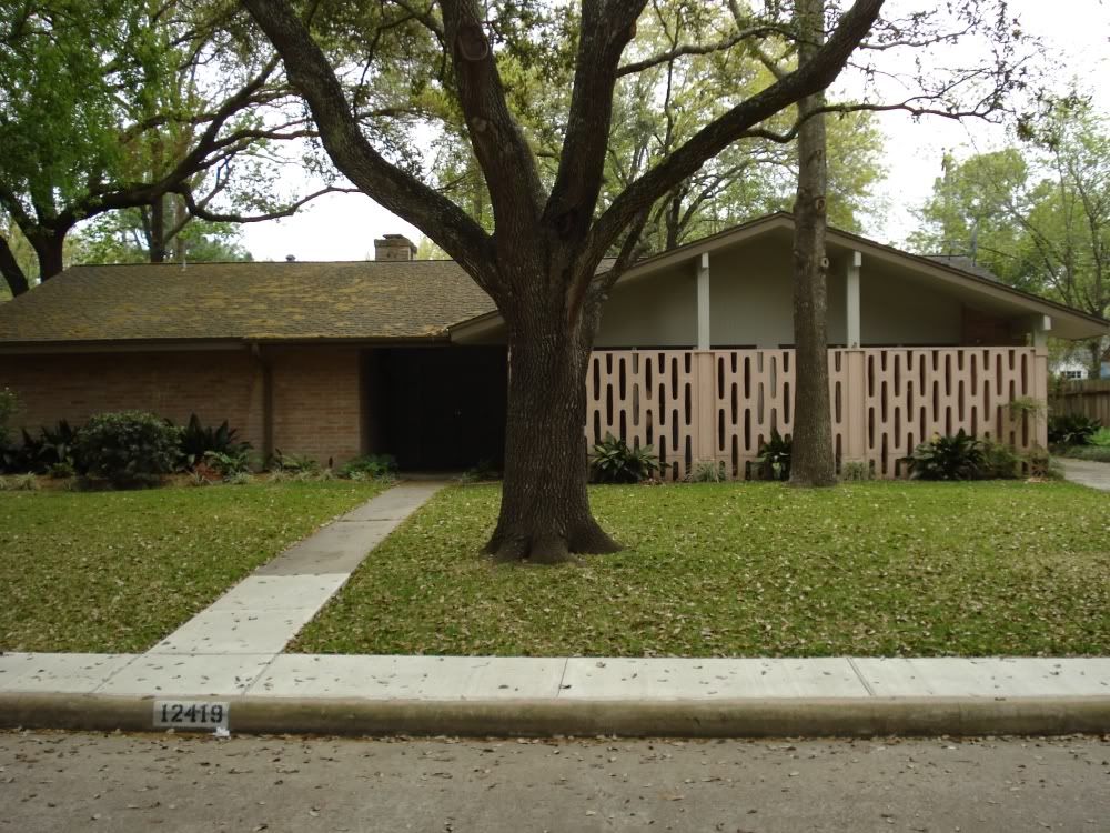
So anyway, that leads me to what you'll see below--small deviations from the norm. Like this house on Woodthorpe with it's groovy 70s concrete privacy screen.
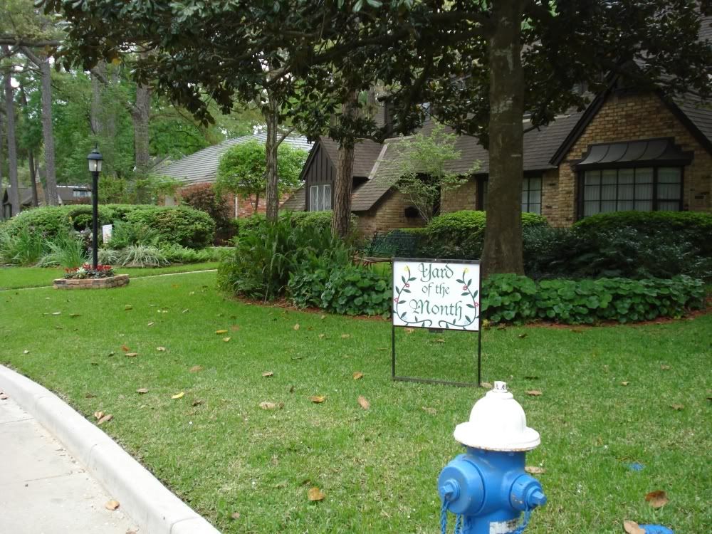
Or this extravagant front yard on Perthshire at Frostwood (obviously appreciated by the neighbors!).
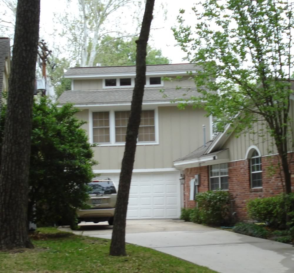
Garage apartments are very unusual in this neighborhood. This one on Kimberley caught my eye because it has what I take to be a clerestory. I'd love to see what it looks like on the inside.
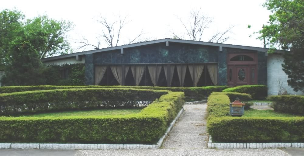
This house at Barryknoll and Frostwood has a dramatic marble front, totally unlike anything else in the neighborhood. My guess is that it was added to the original house.
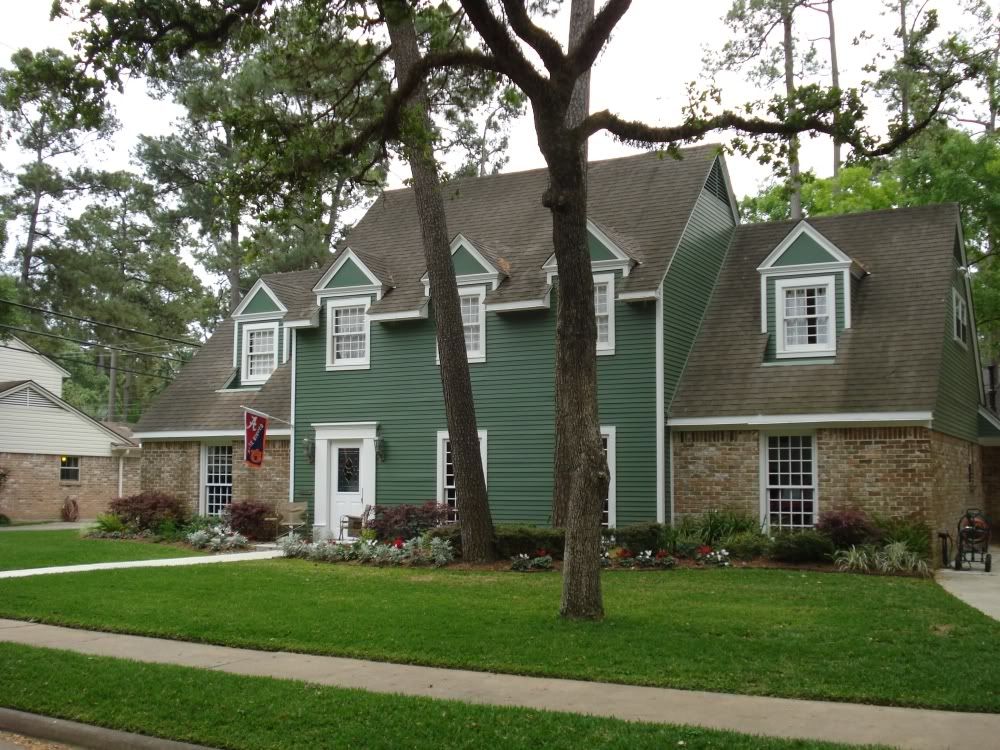
Sometimes a good paint job is enough to distinguish a house, as with this colonial on Boheme.
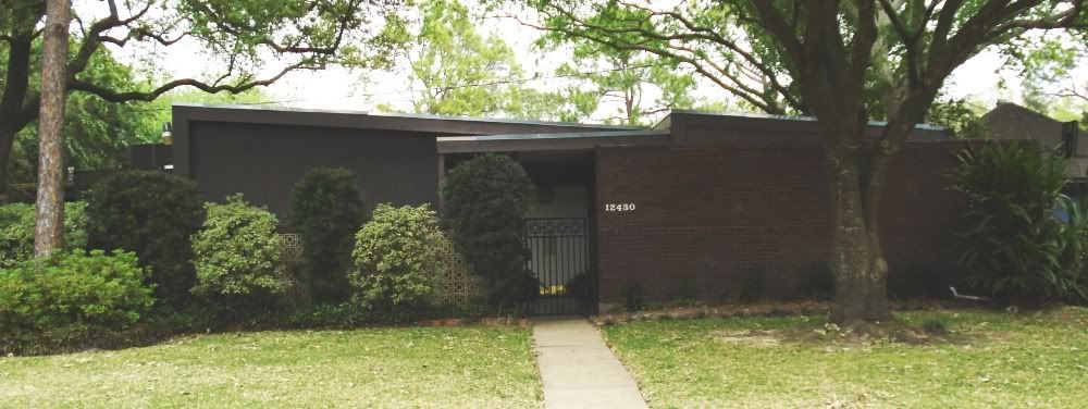
There are very few modern houses in this neighborhood, all west of Gessner for some reason. This dark brown model is on Perthshire.
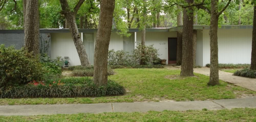
This one is on Boheme, right next door to the colonial house.
Of course, if you want variation, one way to achieve it is to build a brand new house. Needless to say, this neighborhood hasn't escaped McMansion supersizing. This behemoth is on Overcup.
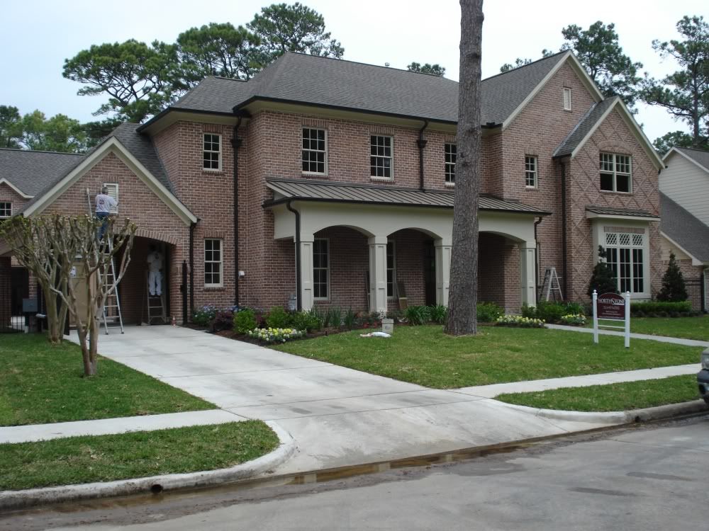
This one is under construction on Taylorcrest.
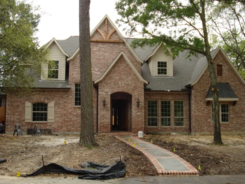
Not all houses built after 1965 are hideous monstrosities, though.
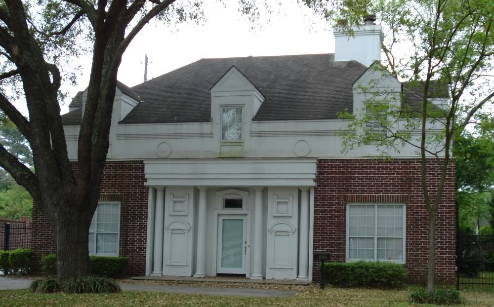
This Georgian-style house on Perthshire was built in 1992. Like most of the houses in the neighborhood, it has a red brick exterior, and it is not grotesquely out-of-scale with its neighbors. But it has an elegance generally lacking in the earlier houses in the neighborhood, and it has aged beautifully.
Of course, this ride wasn't entirely residential. Where Gessner meets I-10 is a confluence of commerce and medicine--Memorial City Mall on the east, and Memorial Hermann Memorial City hospital on the west. The two are even in the process of meeting--a skybridge across Gessner is being constructed to connect the two.
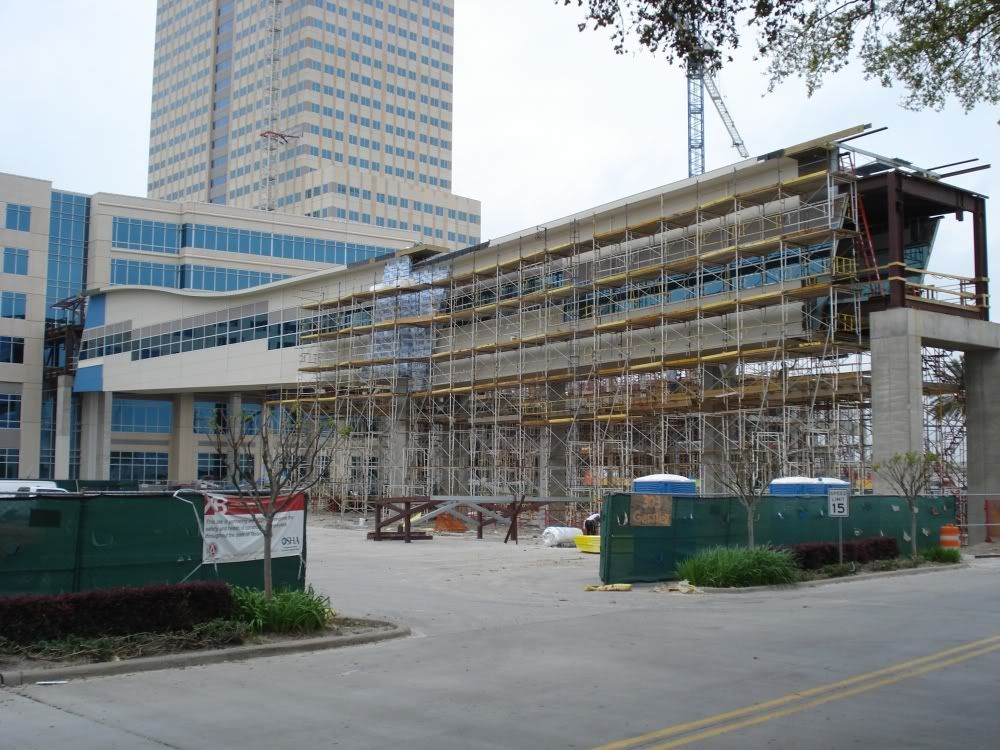
OK, you may say, boy that skybridge looks expensive. Can't people just walk to Memorial City from the hospital. Even counting the trek across the parking lot, the two structures are less than a block apart. And crossing Gessner is not difficult. In the .38 miles along Gessner from Barryknoll to I-10, there are four stoplights with crosswalks (making it a real pain to drive down Gessner, I can tell you). On the other hand, maybe it's not such a good idea for sick people to walk that far on 100+ degree days.
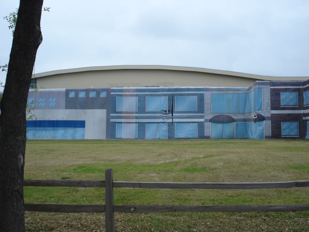
This appears to be where the skybridge will connect with the mall. I like the hanging tarp facade with its feeble trompe l'oeil effect.
The main construction here is a 30-story skyscraper, where the Memorial Hermann system will be moving its head offices.
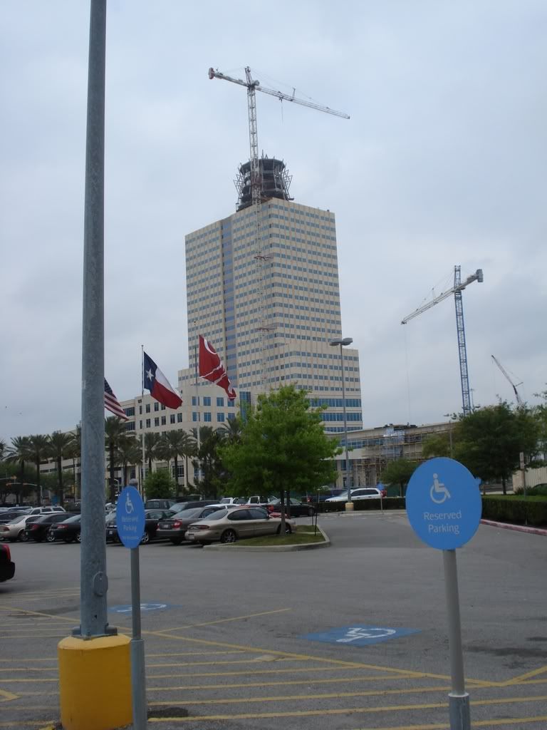
Of course, everyone wants to know about the freaky truncated cone on top. The first question is, what is it for? (I have heard it suggested that helicopters could land there, but seriously...) The more important question is, who is it that, as this building was being designed, thought this thing would look good? Swamplot has some additional info (you can rent offices in the cone!).
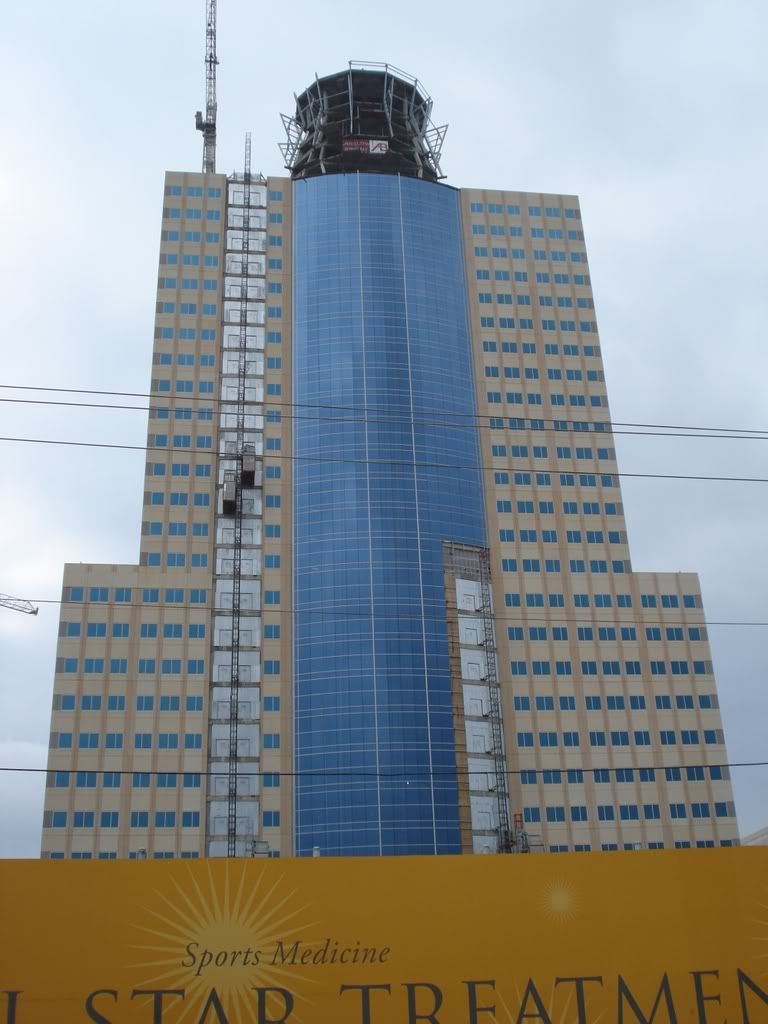
The side of the building that faces the freeway looks pretty grand, however.

The residential streets branch off of two north-south streets, Plantation and Frostwood. My understanding is that this area was developed by a man named Frost, but I can't find details. The houses here were built mostly between 1959 and 1965. The lots tend to be small compared to those in the Villages (just east of these subdivisions). In fact, if you go immediately south or west, the lots and the houses tend to be larger. This is where Memorial starts to become the more familiar kind of Houston suburb--similar houses on same-sized lots, with developers reusing floor-plans and exterior designs.

These two houses (on Beauregard and Pine Rock respectively) are basically mirror images of one another. The Pine Rock house seems to have a slightly shallower roof, and the original white bricks have been painted. (The design seems to have been a semi-Japanese pastiche--by far the most exotic of the standard plans the developers used). The further west you go, the more pronounced this approach to development is. Swamplot had a great post about four identical houses in Bear Creek Meadows, all foreclosed or close to it, for sale. Those houses were only four years old. When houses are over 40 years old, time can start granting them some individuality. People plant their yards differently (and oaks planted 40 years ago are quite majestic now), they paint their houses different colors, they change their walkways or exteriors or roofs, etc. But the variation is very small. I had a Steve Reich album on my IPod as I rode (Sextet, Piano Phase, and Eight Lines played by the London Steve Reich Ensemble--I recommend it highly), and it occurred to me that a neighborhood like this is like a Steve Reich piece, where there is a comfortable, rhythmic sameness with tiny changes as you go along. The tiny changes wouldn't have even caught my eye while riding through the much more heterogeneous Memorial Villages, but here they stand out.
(One reason why houses seem so similar in these middle class subdivisions is that developers designed them that way, but another reason is that the residents here place a high value on conformity. The problem is that individuality and eccentricity are seen as potentially destructive--economically (home values may fall) and even socially. And even if the residents could accept outward signs of eccentricity, it's hard for most people to distinguish between eccentricity and socially pathological behavior. The average homeowner, looking at his neighbor's front yard, may be unable to distinguish between a rusted car on blocks and a John Chamberlain sculpture--so it is easier to simply disapprove of both. Which is too bad for me because I, of course, favor outward expressions of individuality when I'm riding my bike around.)
So anyway, that leads me to what you'll see below--small deviations from the norm. Like this house on Woodthorpe with it's groovy 70s concrete privacy screen.

Or this extravagant front yard on Perthshire at Frostwood (obviously appreciated by the neighbors!).

Garage apartments are very unusual in this neighborhood. This one on Kimberley caught my eye because it has what I take to be a clerestory. I'd love to see what it looks like on the inside.

This house at Barryknoll and Frostwood has a dramatic marble front, totally unlike anything else in the neighborhood. My guess is that it was added to the original house.

Sometimes a good paint job is enough to distinguish a house, as with this colonial on Boheme.

There are very few modern houses in this neighborhood, all west of Gessner for some reason. This dark brown model is on Perthshire.

This one is on Boheme, right next door to the colonial house.

Of course, if you want variation, one way to achieve it is to build a brand new house. Needless to say, this neighborhood hasn't escaped McMansion supersizing. This behemoth is on Overcup.

This one is under construction on Taylorcrest.

Not all houses built after 1965 are hideous monstrosities, though.

This Georgian-style house on Perthshire was built in 1992. Like most of the houses in the neighborhood, it has a red brick exterior, and it is not grotesquely out-of-scale with its neighbors. But it has an elegance generally lacking in the earlier houses in the neighborhood, and it has aged beautifully.
Of course, this ride wasn't entirely residential. Where Gessner meets I-10 is a confluence of commerce and medicine--Memorial City Mall on the east, and Memorial Hermann Memorial City hospital on the west. The two are even in the process of meeting--a skybridge across Gessner is being constructed to connect the two.

OK, you may say, boy that skybridge looks expensive. Can't people just walk to Memorial City from the hospital. Even counting the trek across the parking lot, the two structures are less than a block apart. And crossing Gessner is not difficult. In the .38 miles along Gessner from Barryknoll to I-10, there are four stoplights with crosswalks (making it a real pain to drive down Gessner, I can tell you). On the other hand, maybe it's not such a good idea for sick people to walk that far on 100+ degree days.
This appears to be where the skybridge will connect with the mall. I like the hanging tarp facade with its feeble trompe l'oeil effect.

The main construction here is a 30-story skyscraper, where the Memorial Hermann system will be moving its head offices.

Of course, everyone wants to know about the freaky truncated cone on top. The first question is, what is it for? (I have heard it suggested that helicopters could land there, but seriously...) The more important question is, who is it that, as this building was being designed, thought this thing would look good? Swamplot has some additional info (you can rent offices in the cone!).
The side of the building that faces the freeway looks pretty grand, however.

Labels: 77024, Houston Streets

4 Comments:
Ooh! Getting even closer to my neighborhood. Those are the houses I drive by every single day on my way to work (which is very close to the highly-congested mall/hospital area). I've always wondered about that house with the marble front... Who ever thought that looked good? And that dark brown modern number on Perthshire has long been a favorite of mine...
Yeah, the marble is really kitschy, but I give them credit for trying something different. The brown modern is so unassuming, but I agree with you entirely--it was really the best looking house I saw (maybe the faux Georgian is its equal).
I have speculated about the cake topper on the new MHHC building since it started to take shape. I had all sorts of ideas - is this where they'll keep their really important people? (Wouldn't a 360 office up there be cool?) What the hell is the POINT of it? I have a good friend who works at the MemHerm foundation - she said this is a "branding" step, that all the new MH buildings will have it, and that the only thing in it will be plant facilities. Pretty feeble, eh?
The whole "branding" thing makes perfect sense... or it would if the "robot head" didn't look so silly. Personally, I'm all for architects trying to make their buildings look interesting, but this thing is kind of ridiculous. Maybe it'll look better when it is complete--but if you go by the drawings I've seen, it seems as if it will just look gaudy (shame it won't look Gaudi).
Anyway, according to Swamplot, there will be offices up there in the bottom layer. A 360-office is a neat idea, but if you look closely at how big that thing is, such an office would be freaking enormous. I doubt if the even the most self-aggrandizing CEO would have an office that big. On the other hand, a revolving restaurant would be just kitschy and amusing enough to work!
Post a Comment
Subscribe to Post Comments [Atom]
<< Home